 William Janeway
The role of prepress collaboration software in packaging design
The prepress process plays a critical role in ensuring high-quality packaging production. But with multiple stakeholders involved — including...
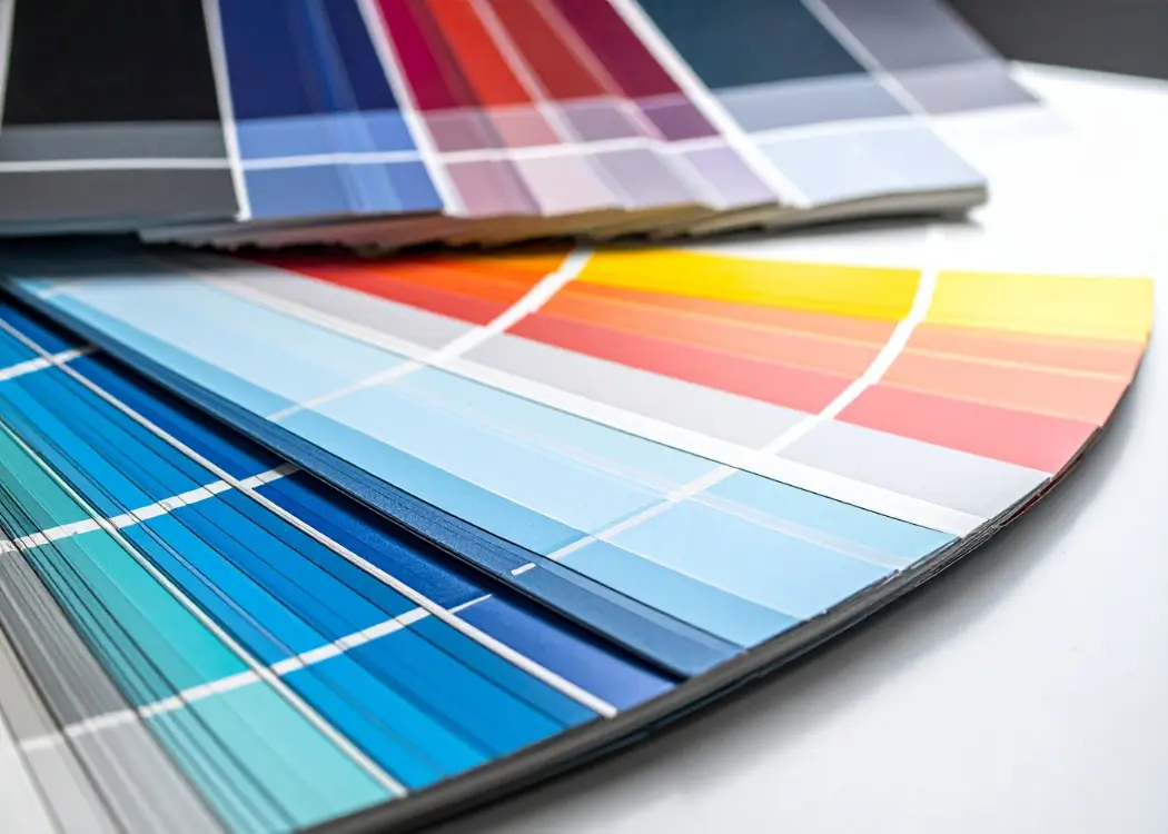
In packaging design, color accuracy is more than an aesthetic choice — it’s a reflection of your brand’s identity and consistency. Whether you’re printing thousands of cartons, sleeves, or labels, each one needs to look identical on the shelf. This is where color separation becomes essential.
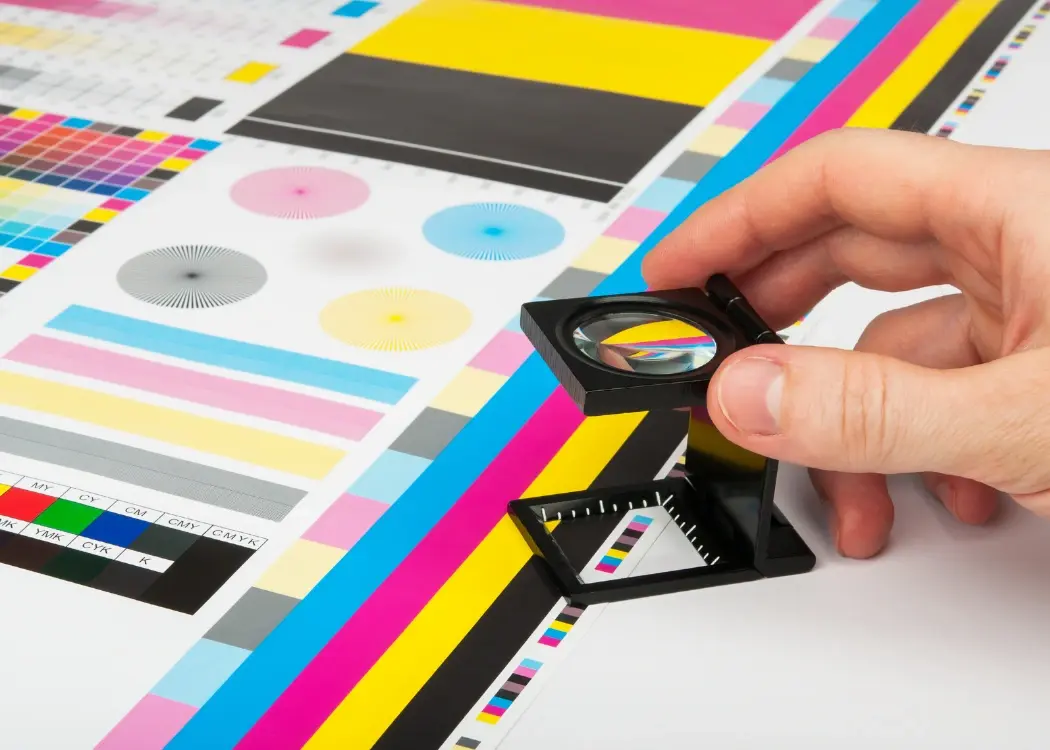
Color separation is the prepress process of dividing a digital artwork into individual color layers so that each one can be printed separately. These layers — typically Cyan, Magenta, Yellow, and Black (CMYK) — are combined during printing to reproduce the complete image.
In some cases, spot colors (like Pantone inks) are used for brand elements that need exact tone reproduction, such as a logo or background color. Each separation corresponds to a specific printing plate or cylinder, which applies its color layer in perfect alignment with the others.

CMYK (Process Color Separation)
This standard method uses four colors that blend to create the full image. It’s ideal for photographic or detailed designs.
Spot Color Separation
Each ink is mixed and printed separately — commonly used for corporate colors or metallic and fluorescent inks that can’t be replicated with CMYK.
Hybrid Separation
Many packaging projects use both CMYK for imagery and spot colors for logos or key brand elements.
Brand Consistency Across Print Runs
Correct separations ensure that your signature red or blue looks the same on every batch and every product line.
Prevents Expensive Printing Errors
Misregistration or overlapping colors can ruin a print job. Proper separations ensure each layer aligns precisely.
Optimized for Printing Techniques
Different print methods — flexographic, offset, gravure, or digital — require tailored separations for best results.
Supports Sustainability and Efficiency
Streamlined separations can reduce ink waste and reprints, supporting both environmental and cost goals.
Always design in CMYK color mode, not RGB.
Use Pantone libraries for defined brand colors.
Collaborate early with prepress and print suppliers to understand limitations.
Use digital proofing tools to review separations before production.
Manage artwork versions and approvals centrally to avoid outdated files going to print.
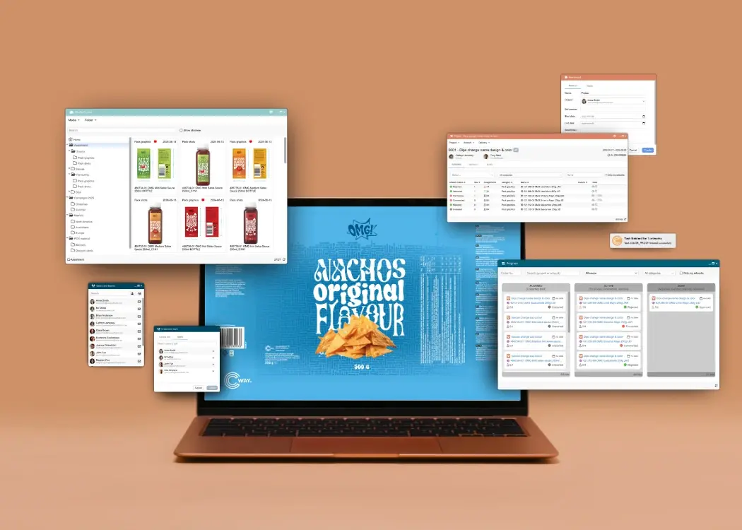
Platforms like Cway software simplify artwork approval and version control, ensuring teams deliver print-ready files with accurate separations every time. From proofing to final approval, automated workflows help eliminate errors and maintain brand consistency — no matter how many stakeholders or markets are involved.
The prepress process plays a critical role in ensuring high-quality packaging production. But with multiple stakeholders involved — including...
Managing packaging design today involves far more than simply creating visual assets. From regulatory checks to version tracking and approvals, the...

Brand consistency is what makes a product instantly recognizable and trustworthy. From packaging design to marketing materials, every detail shapes...