 Ekaterina Skalatskaia
You’ll want to buy these K-beauty products just for the packaging
Let’s be honest: we all love a good serum, but when it comes in a bottle shaped like a milk carton or a cream that looks like a peach? Take. Our....
Walk into any convenience store or supermarket today and the craft beer shelf immediately overwhelms with creativity. Bright colours, quirky illustrations, experimental typography — a visual explosion that feels almost chaotic.
Yet among all the artistic expression, one truth still stands:
The brands that get seen are the brands that get sold.
And getting seen rarely comes from being “more creative.”
It comes from being more recognisable.
This is where packaging design becomes a strategic weapon — and where some of Sweden and Europe’s most successful craft breweries provide strong examples of how to build brand through visual clarity, distinctive assets, and smart structure.
Craft beer shelves are crowded, and while many labels look beautiful, few are memorable. Strong brands use distinctive visual assets — shapes, colours, illustration styles — that quickly cue the brand before the name is even read.
Omnipollo’s labels are instantly identifiable through surreal illustrations and bold, graphic forms. The designs vary dramatically from release to release, but the brand’s artistic DNA makes each can unmistakably theirs.
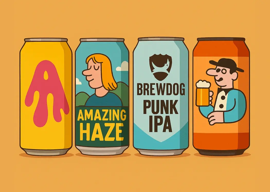
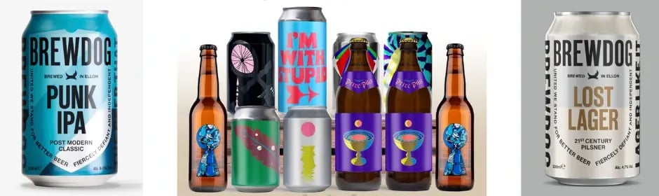
BrewDog takes a different approach. Their rigid typographic system and high-contrast colours create a design that can be recognised across the room — and across markets.
Both brands prove that recognition doesn’t require sameness.
It requires a visual identity strong enough to rise above shelf noise.
Packaging is often the first touchpoint for consumers. The best brands use the label not just as decoration, but as a story.
Poppels uses clean, minimal layouts with flavour cues and batch information presented upfront. The storytelling is transparent and confident — signalling craft quality without needing elaborate graphics.
Mikkeller’s label art features recurring characters and humorous scenes that act as an ongoing visual universe. Consumers don’t need to read a word to understand the brand’s playful spirit.
Where some brands crowd the label with detail, these breweries let design carry the message effortlessly.

A strong packaging system helps consumers navigate a complex range of IPAs, lagers, stouts, and limited editions. The goal: clear differentiation without losing brand identity.
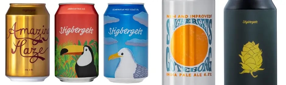
Stigbergets achieves this with consistent layouts and a colour-coded approach that makes their beers easy to spot and even easier to shop. The structure gives the brand a calm, confident presence on shelf.
Range architecture turns recognition into repeat purchase.
Premium cues don’t stop at graphics. The physical feel of the can also influences perception.
Omnipollo and Mikkeller often use:
Matte finishes
Taller formats
Premium printing techniques
These tactile decisions reinforce the idea of craftsmanship and give the beers a collectible feel.
Scandinavian consumers hold brands to high environmental standards, and packaging is a key place to demonstrate commitment.
Through minimalist design, recyclable materials, and transparent communication, Poppels aligns its packaging with the values of modern Nordic craft culture.
Sustainability here isn’t a “bonus” — it’s a brand builder.
In craft beer, packaging often becomes content. The beers that get photographed, shared, and collected gain visibility far beyond the store.
Omnipollo designs spark social engagement through bold, gallery-like artwork.
Mikkeller labels are instantly shareable because of their iconic illustrations.
BrewDog benefits from typography that stands out clearly in photos.
A can that gets posted becomes free media — and a repeating brand impression.
Seasonal releases and collaborations give breweries space to experiment while keeping brand identity intact.
Mikkeller uses collaborations to expand its artistic universe and invite new audiences.
Stigbergets introduces fresh design cues in limited runs without sacrificing its core structure.
This approach keeps the brand culturally relevant, always offering something new without confusing consumers.
The craft beer industry thrives on creativity — yet creativity alone doesn’t build strong brands. The breweries that stand out consistently combine artistry with strategy:
Clear visual identity
Recognisable assets
Strong range architecture
Authentic storytelling
Premium tactile cues
Sustainability
Social-media-ready design
Packaging isn’t just decoration.
It’s one of the most powerful brand-building tools a craft brewery has.
As craft beer brands evolve, so does the complexity of their packaging. More SKUs, faster release cycles, seasonal drops, collaborations, multiple markets, legal updates — the artwork process quickly becomes as chaotic as the beer shelf itself.
That’s why modern breweries are turning to dedicated artwork management platforms like Cway.
A centralised system ensures that:
every design version is tracked
every stakeholder reviews the right file
every regulatory detail is correct
every launch hits the shelf on time
Most importantly, it keeps brand consistency intact across formats, markets, and rapid releases — the same consistency that drives recognition and repeat purchase.
Creativity builds interest.
Control builds brand.
And in a category where packaging is the brand, breweries that streamline their artwork process gain a real competitive edge.

Let’s be honest: we all love a good serum, but when it comes in a bottle shaped like a milk carton or a cream that looks like a peach? Take. Our....
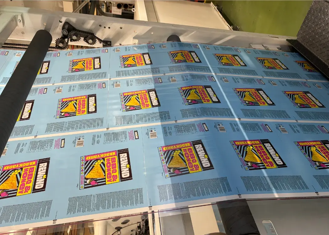
Printing may seem like just one step in packaging production, but for food and beverage brands, it’s one of the most critical stages. A misprint, an...
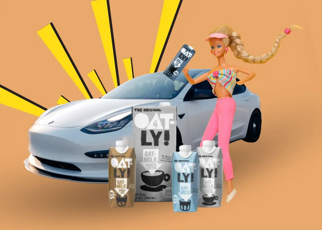
When you think of Barbie, you might picture hot pink plastic. Oatly? Probably that cheeky, handwritten font on a beige carton. And Tesla—sleek,...