 William Janeway
Understanding color separation in packaging design
In packaging design, color accuracy is more than an aesthetic choice — it’s a reflection of your brand’s identity and consistency. Whether you’re...
In retail, packaging has only a few seconds to do its job. Before a customer reads a single word, they react to color.
What determines whether a product stands out or gets ignored is not just the choice of colors — but how they are organized. This is where color hierarchy comes in.
Understanding the difference between dominant and supporting (recessive) colors allows brands to control attention, improve clarity, and ultimately increase product visibility on the shelf.
In packaging design, colors play different roles — they are not equal.
A dominant color is the first thing the eye notices. It defines the overall impression of the product and creates immediate recognition. This is usually the most visible, saturated, or widely used color on the package.
Supporting (recessive) colors work in the background. They don’t compete for attention but instead help organize information, create contrast, and guide the viewer through the design.
A simple way to think about it:
Without this hierarchy, packaging becomes visually noisy. With it, even minimal designs can feel clear, intentional, and premium.
On a crowded shelf, products are perceived as blocks of color before anything else.
A strong dominant color helps a product:
Supporting colors then help:
Without a clear hierarchy, the eye doesn’t know where to look — and the product risks being overlooked.
Creating effective color hierarchy is less about choosing “bright” colors and more about controlling visual attention.
The most effective packaging systems rely on a single primary color that defines the product.
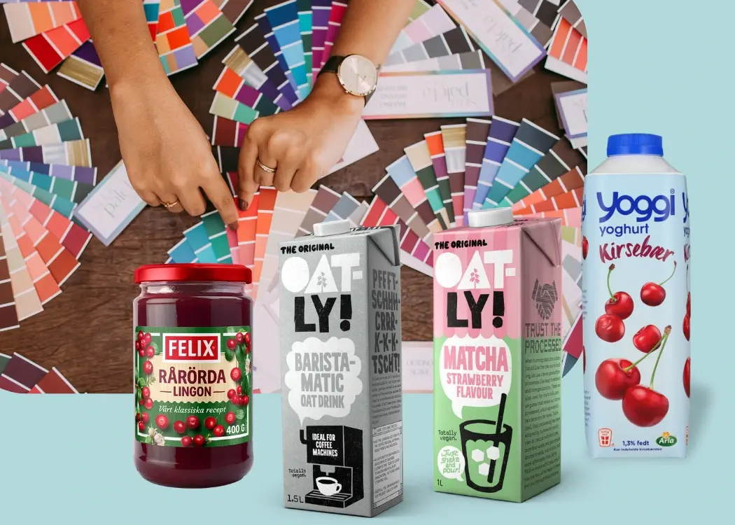
Oatly is a strong example. Its light blue packaging clearly stands out in a category dominated by white and traditional dairy cues. The color is consistent, recognizable, and instantly associated with the brand.
Dominance is created through contrast — not just color choice.
You can increase contrast by:
Arla uses clean white packaging combined with bold blue elements to create strong contrast. The white background acts as negative space, while the saturated blue draws attention to key information like product type and brand. This contrast helps guide the eye quickly and makes the packaging easy to scan on a crowded shelf.
One of the most common mistakes in packaging is using too many colors.
Effective designs typically use:
Limiting the palette makes the dominant color more impactful and improves overall clarity.
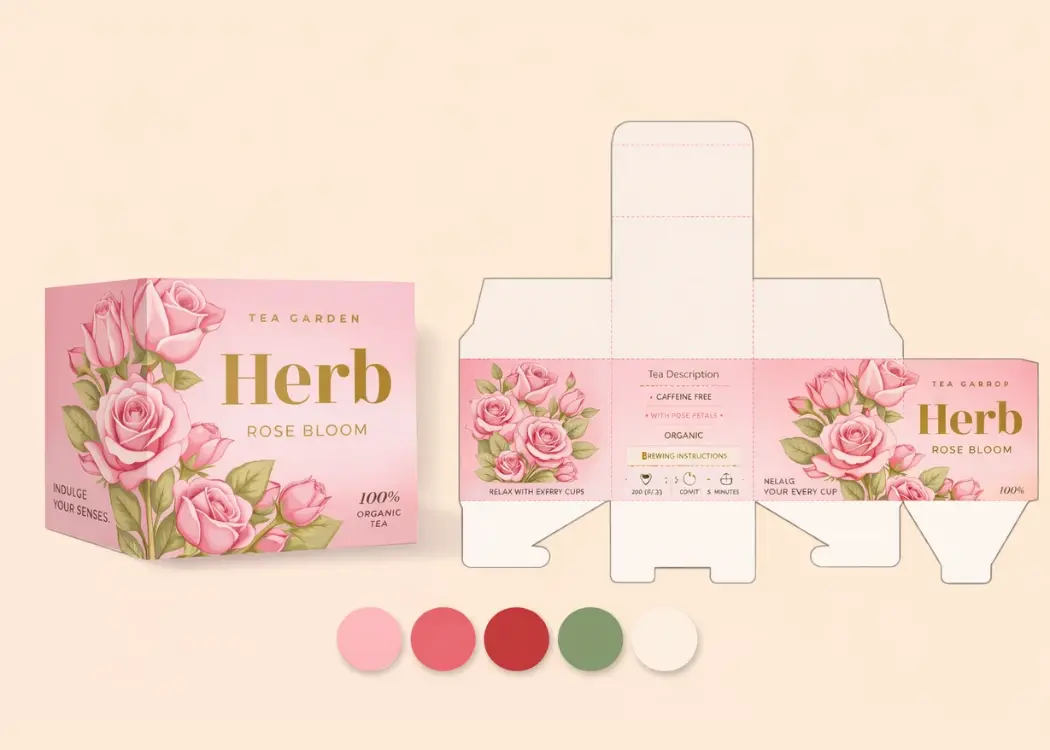
Supporting colors should have a clear function — not just decoration.
They can be used to:
Felix uses a consistent base design across its product range, while relying on supporting colors to differentiate flavors and product types. For example, ketchup, sauces, and ready meals share a recognizable layout, but use different accent colors (red, green, yellow) to signal variants. These supporting colors help shoppers quickly find the right product on the shelf without needing to read the label in detail.
Empty space increases the power of color.
When a dominant color is surrounded by neutral space, it becomes more noticeable and easier to process. This approach also improves readability and gives packaging a more premium, modern feel.
IKEA food packaging often uses clean layouts with restrained color use, allowing key elements to stand out without overwhelming the viewer.
Highly saturated colors tend to feel more dominant, while muted tones recede.
You can create hierarchy by:
Even a bright color can become “recessive” if it is desaturated or used in smaller amounts.
Even well-designed packaging can fail if hierarchy is unclear. Some frequent issues include:
These problems make packaging harder to scan and reduce shelf impact.
Color hierarchy doesn’t just affect aesthetics — it directly influences behavior.
In a retail environment, these factors translate into better visibility and higher chances of purchase.

Great packaging is not about using more color — it’s about using color with intention.
A strong dominant color captures attention. Supporting colors create clarity and structure. Together, they form a system that guides the consumer from first glance to final decision.
In a crowded market, that clarity is what makes packaging work.

In packaging design, color accuracy is more than an aesthetic choice — it’s a reflection of your brand’s identity and consistency. Whether you’re...
FMCG packaging has only seconds to capture attention and communicate value on crowded store shelves. Understanding the elements of design and...
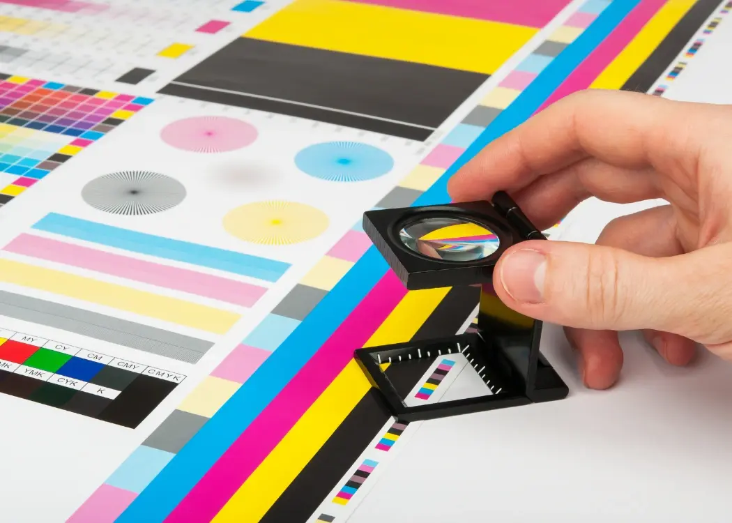
The prepress process plays a critical role in ensuring high-quality packaging production. But with multiple stakeholders involved — including...