 William Janeway
Color hierarchy in packaging: dominant vs recessive colors
In retail, packaging has only a few seconds to do its job. Before a customer reads a single word, they react to color. What determines whether a...
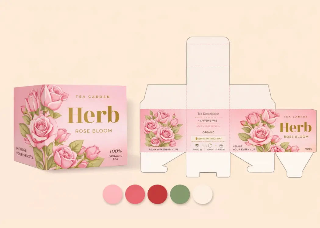
In retail, packaging has only a few seconds to do its job. Before a customer reads a single word, they react to color. What determines whether a...
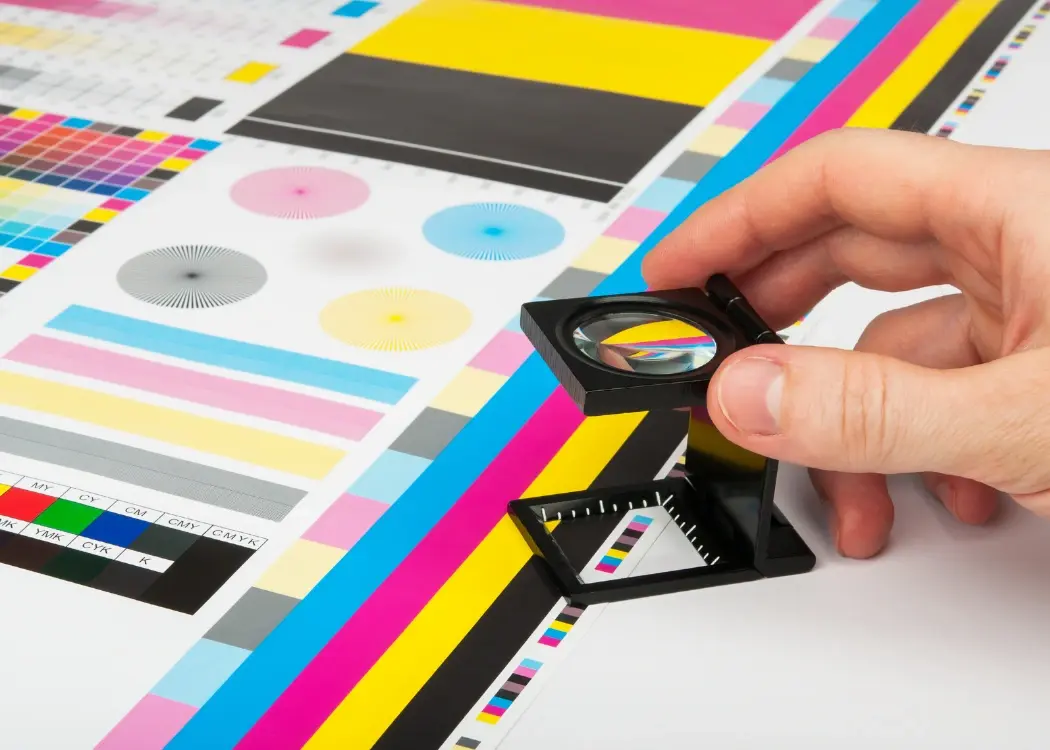
The prepress process plays a critical role in ensuring high-quality packaging production. But with multiple stakeholders involved — including...

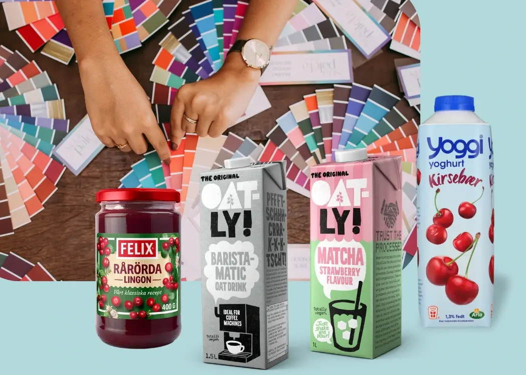
In packaging design, color accuracy is more than an aesthetic choice — it’s a reflection of your brand’s identity and consistency. Whether you’re...