 Ekaterina Skalatskaia
Introducing the new Cway dashboard
The new Cway Dashboard replaces the old table-based layout with a clean, task-oriented interface that helps you stay organized and make decisions...
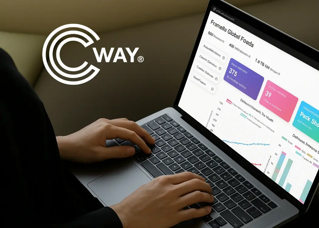
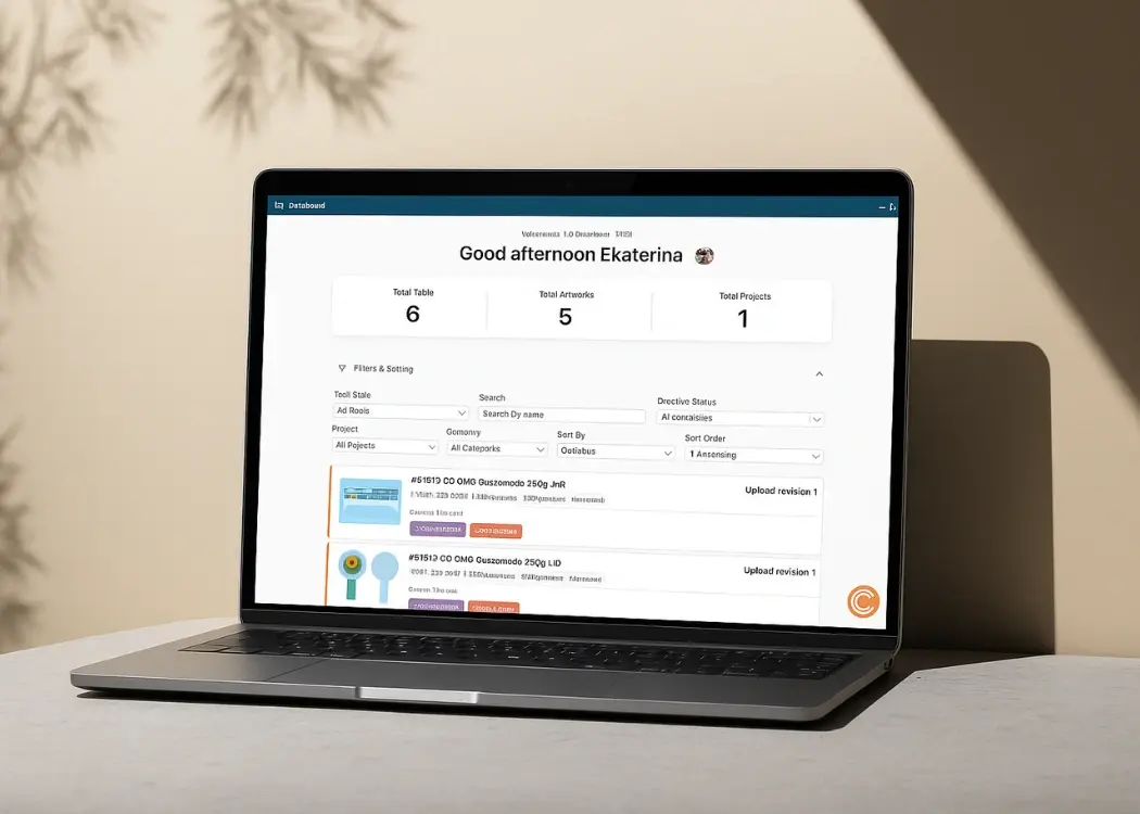
The new Cway Dashboard replaces the old table-based layout with a clean, task-oriented interface that helps you stay organized and make decisions...

At Cway, we’re always looking for ways to refine our products to provide the best possible experience for our users. With our latest update, we...

We’re excited to introduce three major updates that make Cway even more powerful, intuitive, and aligned with the real workflows of creative,...