2 min read

The dashboard every packaging team actually needs

The dashboard every packaging team actually needs
4:42

In today’s world, packaging isn’t just about design. It’s a complex, multi-step process involving marketing, design, quality, regulatory compliance, production, and external partners. To deliver packaging on time and error-free, teams need more than a task schedule—they need an intelligent operations dashboard: a tool that turns raw data into actionable insights and enables decision-making without guesswork.

Why Standard BI Dashboards Don’t Cut It

For packaging teams, it’s not about general statistics—it’s about understanding:

  • Where bottlenecks actually exist in the workflow
  • Which stages slow down product launch
  • Why revisions often come back for rework
  • How workload is distributed across teams and agencies

Traditional BI dashboards provide charts, but rarely answer these practical, workflow-focused questions. Teams need metrics based on real packaging project data—not manual reports or assumptions.

What a Packaging Dashboard Must Show

A modern dashboard should provide end-to-end visibility—from briefing to final approval. According to Cway Insights, effective dashboards include key sections:

1. End-to-End Visibility

The dashboard should track the lifecycle of each artwork: who is handling it, at what stage, and how long tasks are delayed. This eliminates “dark zones” and clarifies where time is really lost.

2. Bottleneck & Delay Analysis

Teams shouldn’t guess why projects are delayed. The dashboard should:

  • Highlight specific stages causing delays
  • Show which roles contribute most to slowdowns
  • Reveal differences between normal task times and anomalies

This allows teams to fix root causes rather than symptoms.

3. Revision & Rework Insights

A dashboard should track:

  • How many iterations each artwork undergoes
  • Where tasks are sent back for rework
  • What types of corrections cause the most revisions

This insight helps optimize briefs, reduce iterations, and increase “first-time-right” outcomes.

4. Workload & Capacity Visualization

Visualizing team and role workload enables:

  • Balanced resource allocation
  • Informed decisions on task redistribution
  • Forecasting peak workload periods

This is critical during seasonal spikes or when collaborating with external agencies.

5. Historical & Comparative Metrics

Comparing metrics across time periods allows teams to:

  • Measure the effect of process changes
  • Track trends
  • Evaluate the impact of improvements

This transforms the dashboard from a reporting tool into a continuous improvement engine.

Key Principles of an Effective Dashboard

To deliver real value, a packaging dashboard should follow these principles:

Reflect the Real Workflow, Not Idealized Data

Data should be captured directly from real workflow events—such as approvals, revisions, status changes, and timestamps—rather than relying on manually compiled reports. This ensures accuracy, eliminates bias, and provides a true picture of how work actually flows through the system. By grounding insights in real activity, teams can identify genuine inefficiencies and make decisions based on facts, not assumptions.

Stay Current

The dashboard should update automatically and continuously, reflecting the current state of projects in real time. This allows teams to react quickly to delays, shifting priorities, or bottlenecks as they happen—not after the fact. Real-time visibility turns the dashboard into a proactive management tool rather than a retrospective reporting system.

Be User-Friendly

Even the most advanced dashboards are ineffective if they are difficult to use or understand. A successful dashboard should be intuitive and accessible to all stakeholders, regardless of technical expertise. It should:

  • Be easy to interpret at a glance, with clear visuals and logical structure
  • Require no manual data preparation or technical setup
  • Load quickly and operate smoothly without friction

When usability is prioritized, teams are more likely to adopt the dashboard in their daily workflows, maximizing its impact and value.

Conclusion: A Dashboard as the Heart of Operational Efficiency

Packaging teams operate in a world of complex workflows, cross-functional collaboration, and tight deadlines. To compete and deliver products on time, they need a dashboard that does more than display numbers—it drives decisions.

Such a dashboard:

  • Makes bottlenecks visible
  • Explains causes of delays
  • Measures the impact of process changes
  • Balances resources and improves quality

By building a dashboard based on real workflow data, packaging teams gain not just a report—but an operational tool for success.

What is an artwork management system and why you need one

What is an artwork management system and why you need one

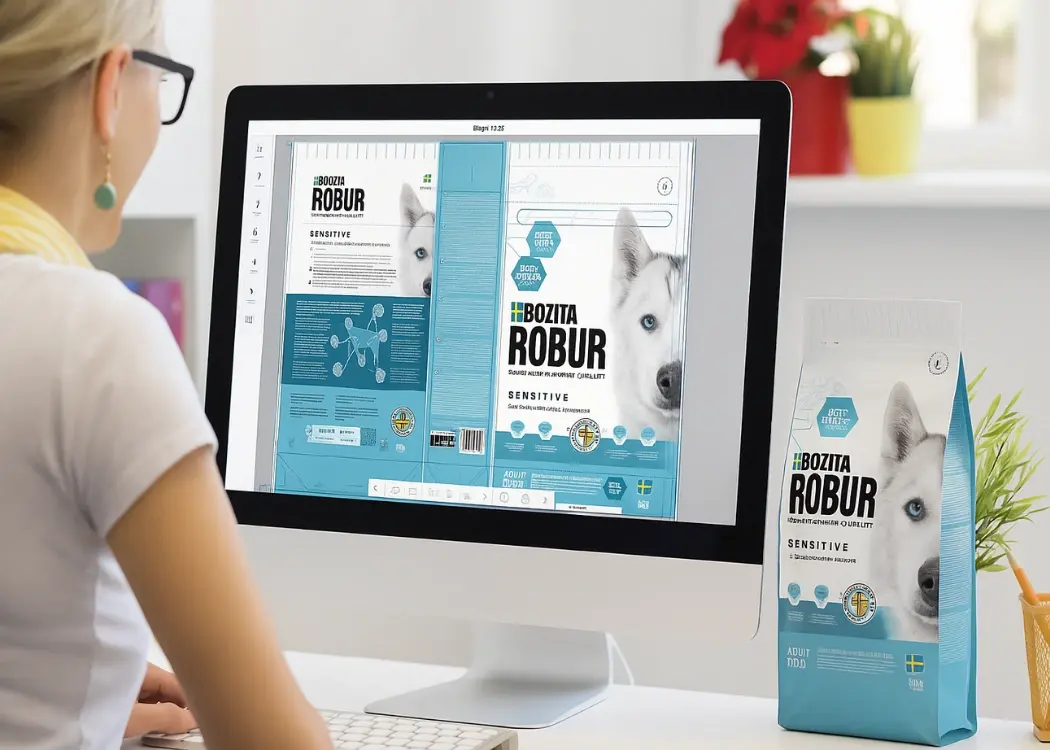
Managing creative assets like packaging, labels, and marketing materials across teams can quickly become chaotic. Without the right tools, delays,...

View Full Article
Best tools to track and manage packaging artwork accurately

Best tools to track and manage packaging artwork accurately

In this article, we’ll explore the top systems for packaging artwork traceability. From compliance to speed, learn how leading tools ensure every...
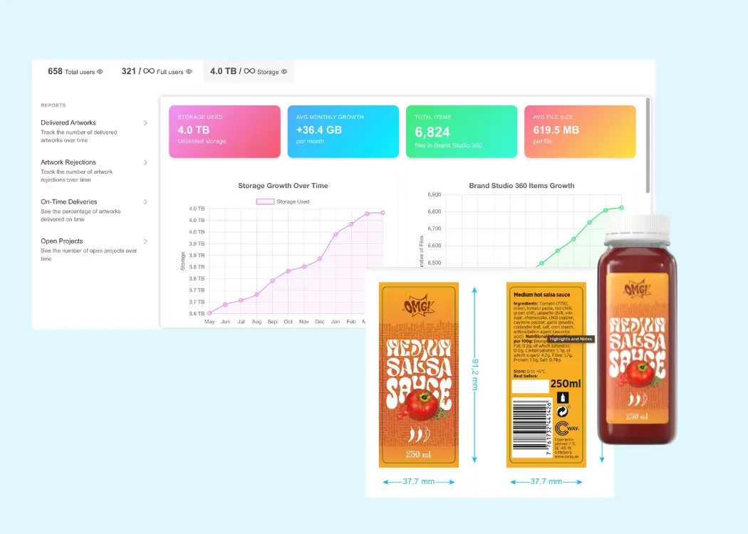
View Full Article
Why modern brands need smarter artwork management solutions

Why modern brands need smarter artwork management solutions

Managing packaging artwork can be a nightmare — endless email threads, unclear responsibilities, missed deadlines. Sound familiar? Without the right...

View Full Article